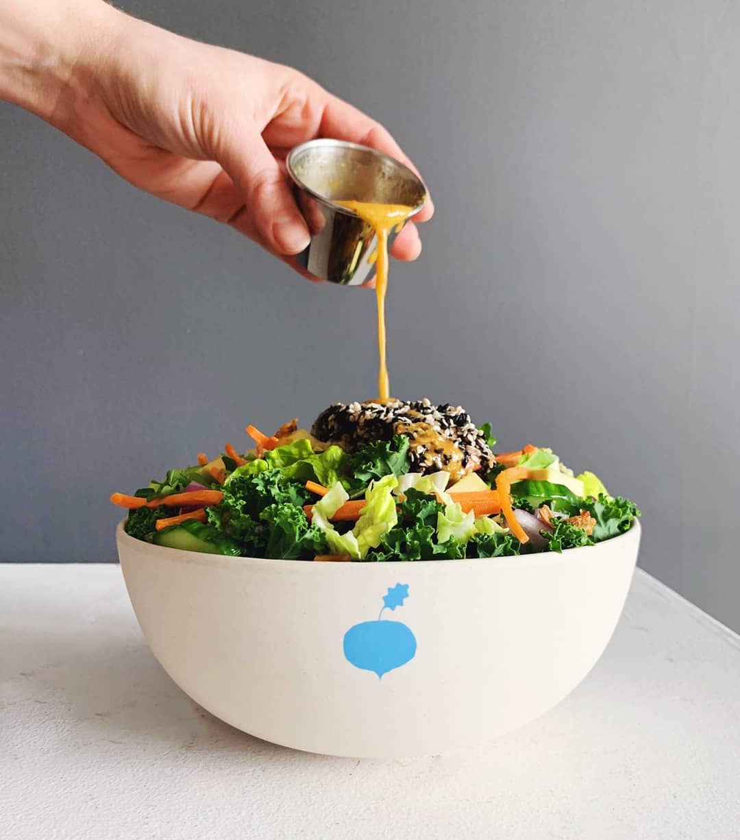
Fresh salad gets a crisp look.
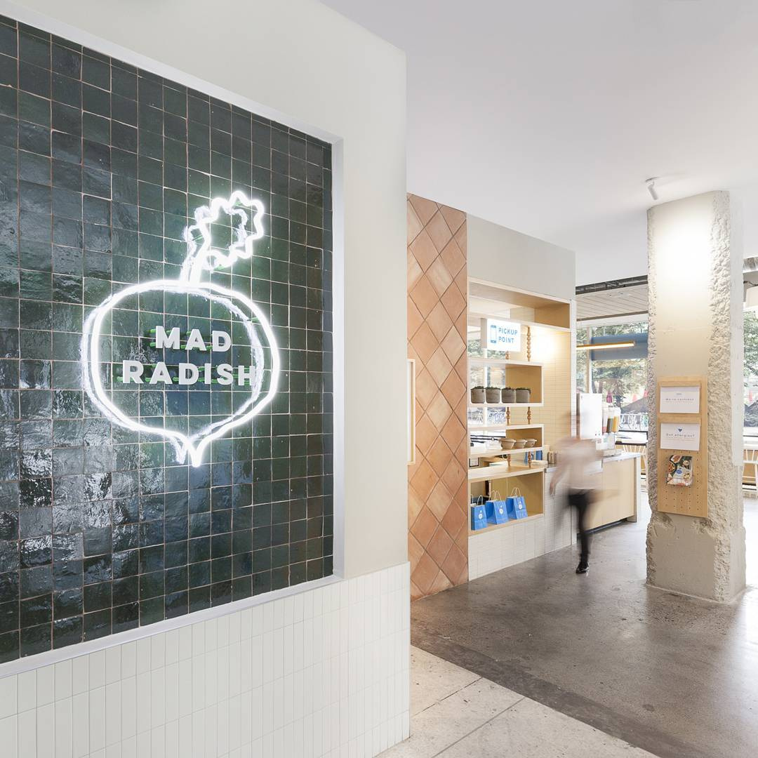
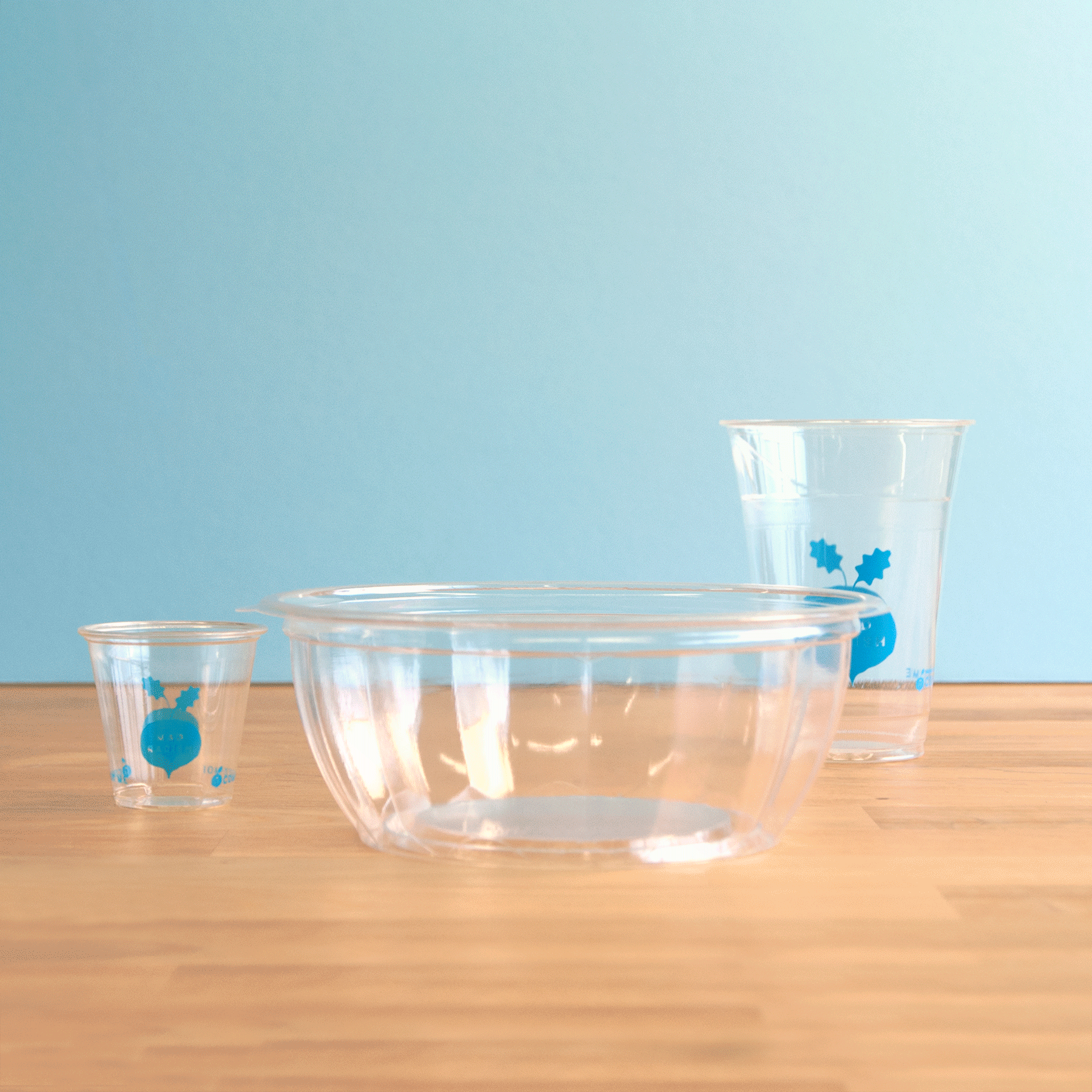
The salad identiy universe is saturated in lime green, we wanted to be different. The brand is designed around a colour that truly stands out, but that still feels crisp, fresh and vibrant. The logo and iconography are hand drawn and has imperfections, just like any healthy fruit or vegetable.
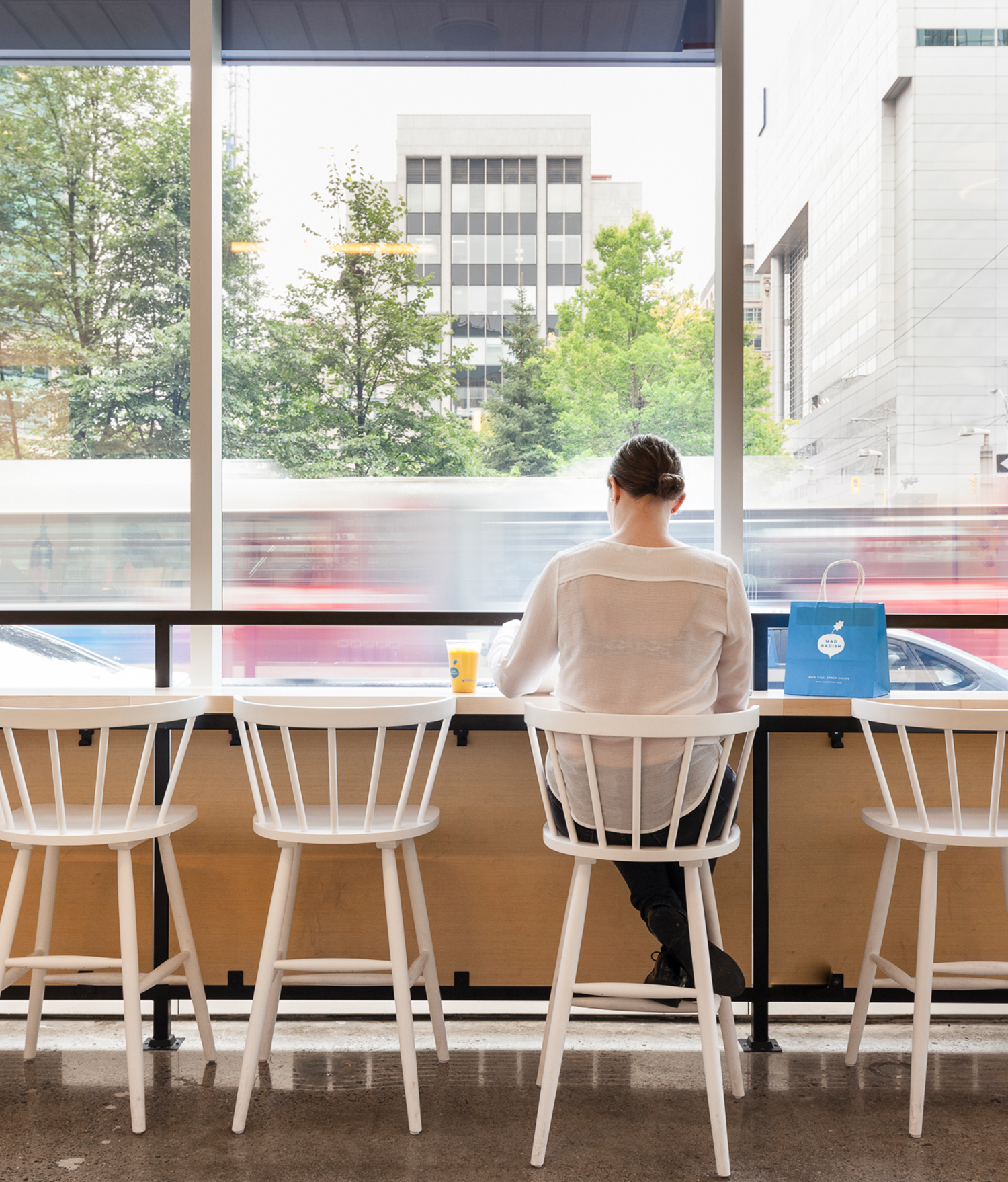
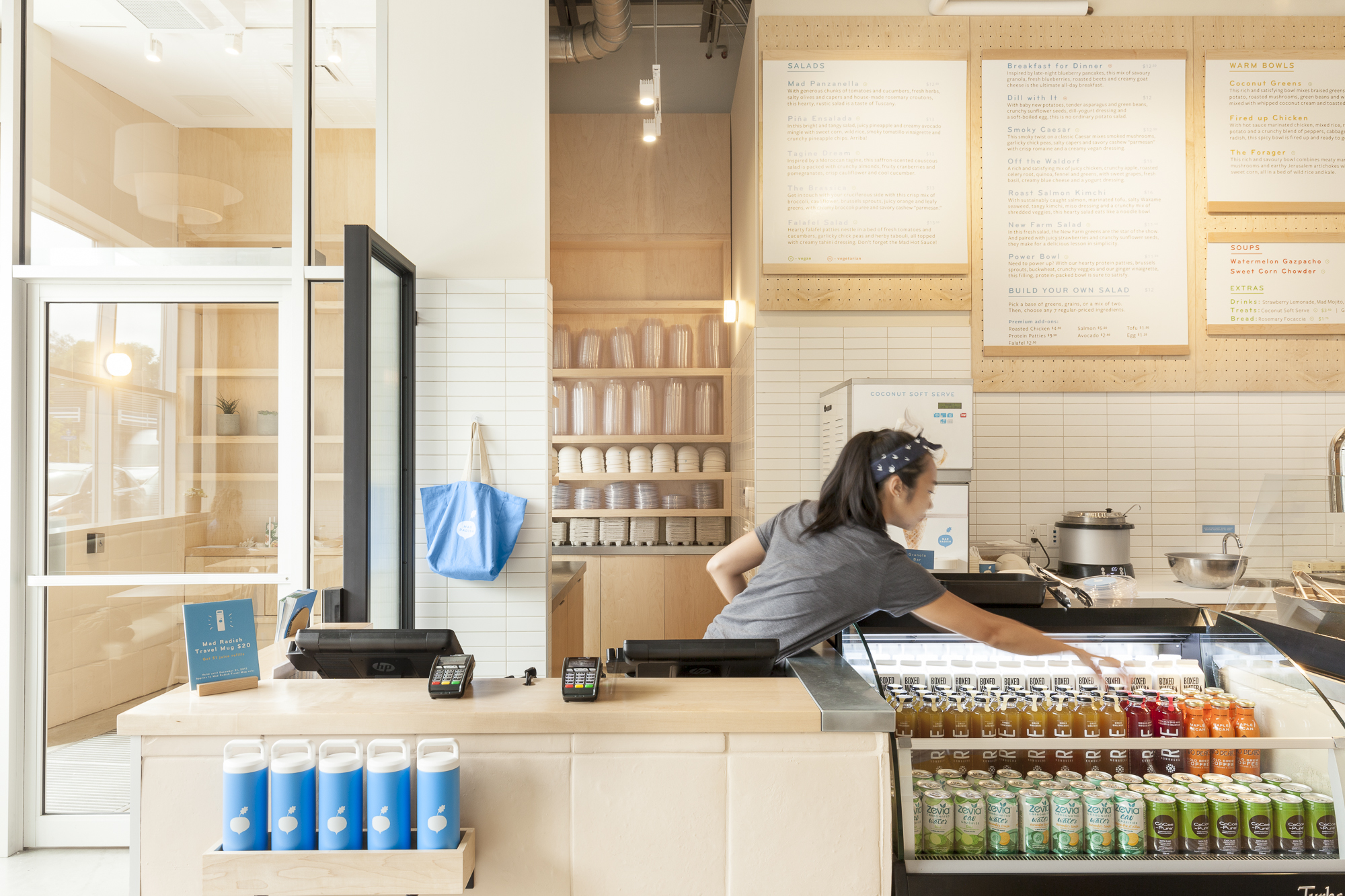
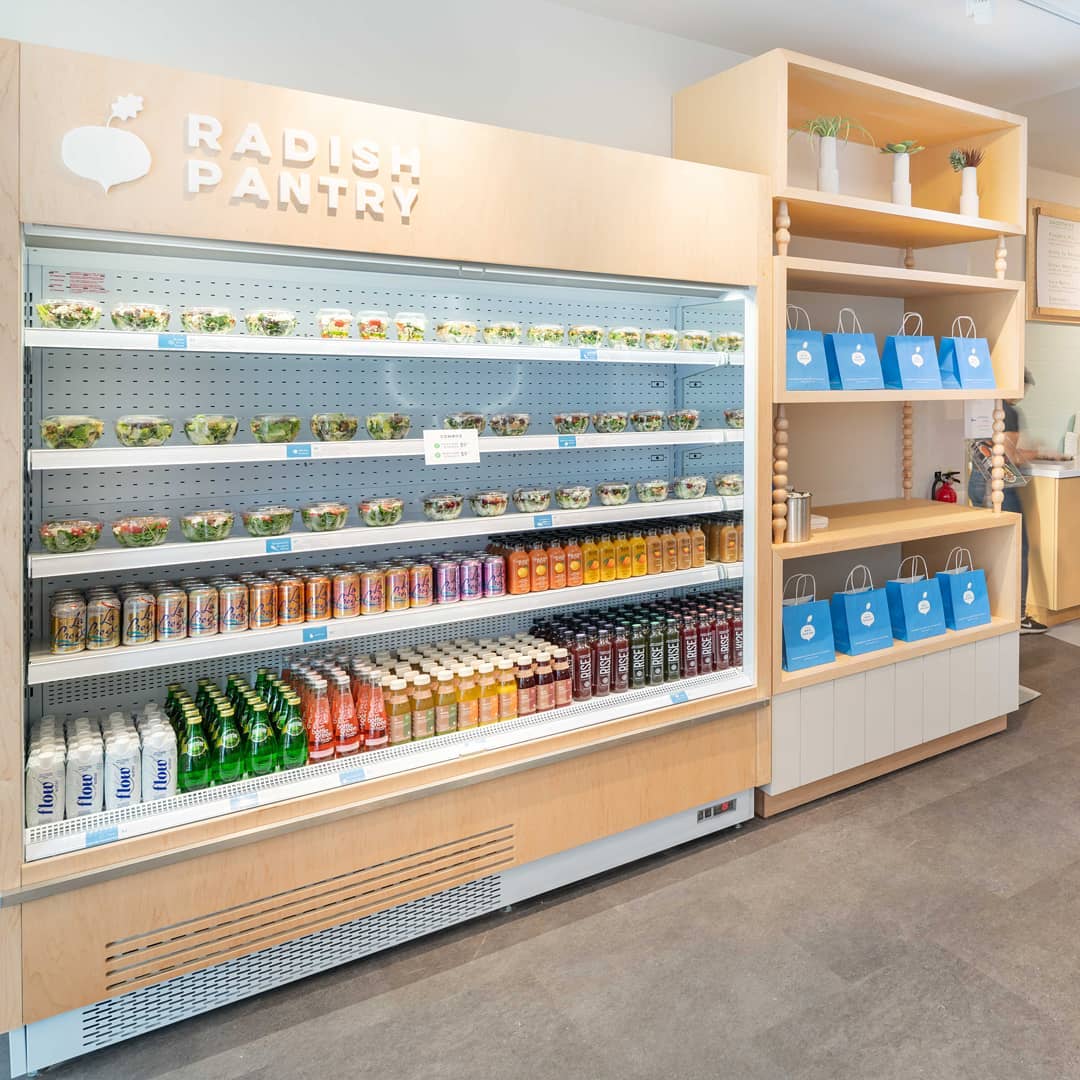
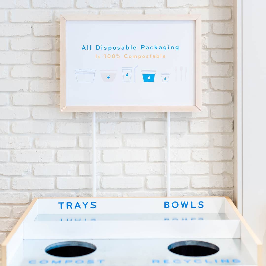
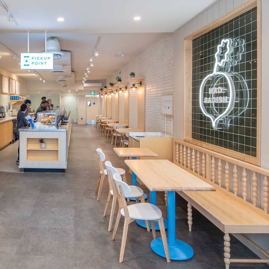
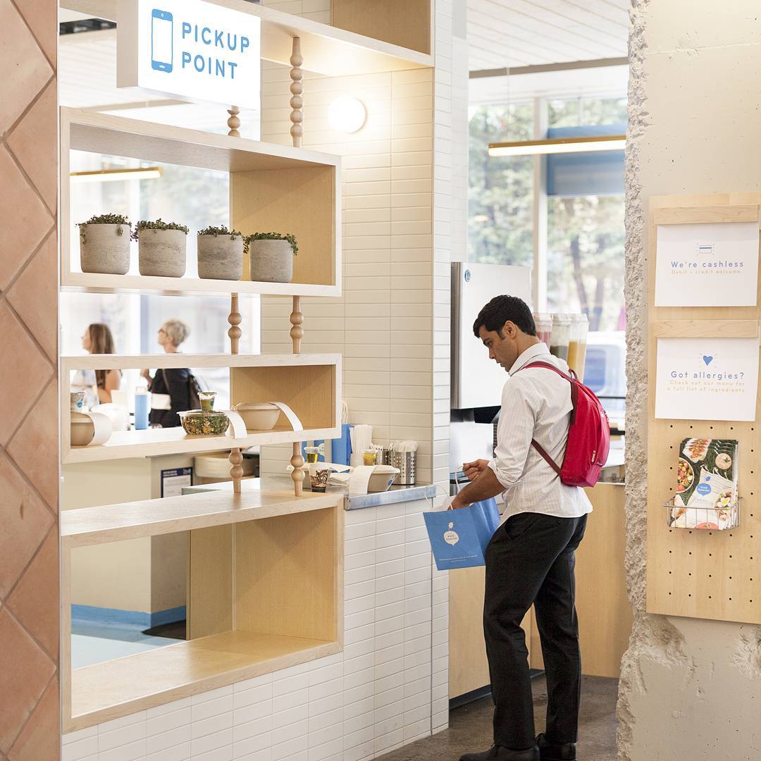
The interior design is warmer and more welcoming than your typical “laboratory, impersonal, bright and sterile” salad restaurant. The interor materials used here are natural to emphasize the organic, additive-free, food approach.
All these elements, together, create a unique, natural, authentic identity. A brand celebrating all the goodness in life.