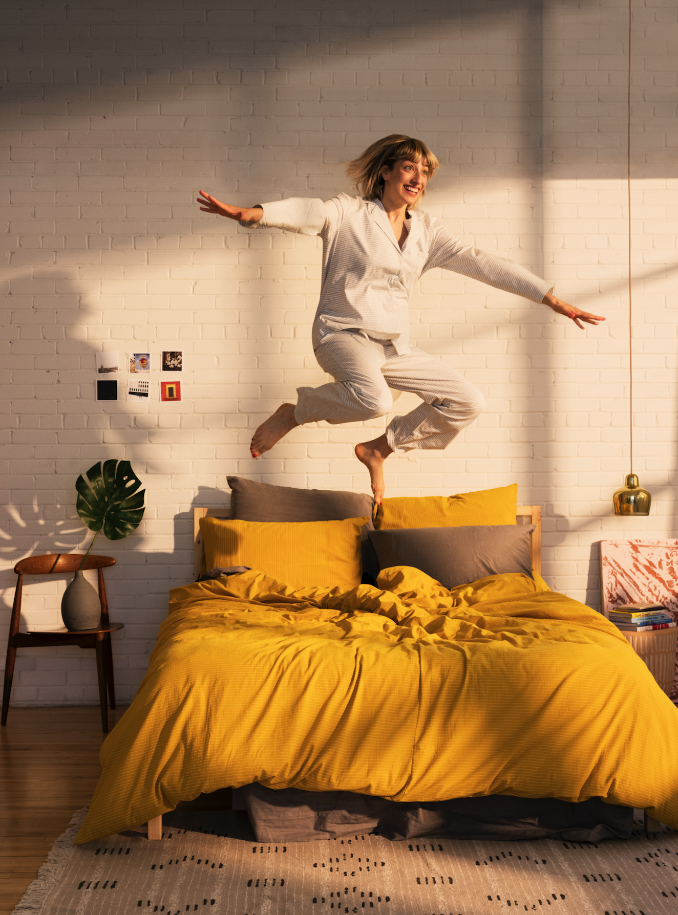
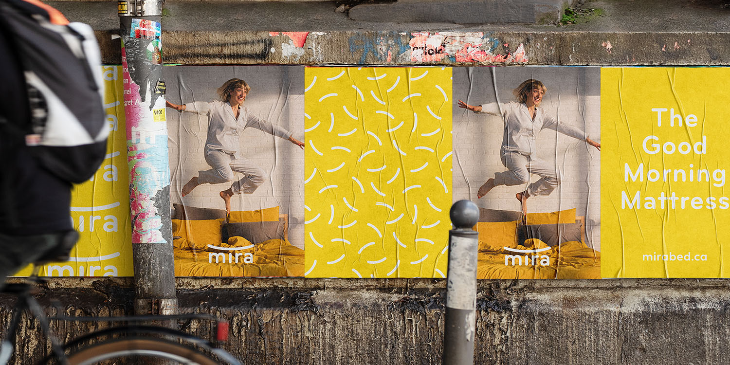
In the darkness of predictable blue, let’s wake up to the newness of dawn..
After analyzing other competitors we quickly realized that there are no companies that that position themselves for the effects of an mattress, what it actually does to your well-being.
Instead most mattress companies position themselves, in tonality design and photography, as the “time to go to bed” brand. The voice is often sleepy, the colours darker and the photography portraits people ready to go to bed in their pyjama or already sleeping. This is insight grew to the general visual identity and allowed us to differentiate the brand yet still stay true to the sleep experience.
As you can see, great collaboration mattress.